
Першим етапом стало глибоке дослідження бренду, його історії, цінностей та цільової аудиторії. Ми прагнули створити символ, що відображав би сутність компанії та її продукції. Відтак, ми розробили кілька концепцій, зосереджуючись на естетиці, яка поєднує традиційні елементи з сучасним підходом.

Основний логотип складається з елегантної типографії, що передає відчуття розкоші та вишуканості. Літери "Rous" виконані в стильному шрифті, який створює відчуття витонченості та ексклюзивності.

Використані кольори - це поєднання класичних срібних відтінків, що символізує розкіш та престиж. Кольори асоціюються з багатством, успіхом і витонченістю, символізують чистоту, інноваційність та елегантність.

Логотип також може використовуватися в монохромному варіанті, зберігаючи при цьому свою елегантність та впізнаваність.
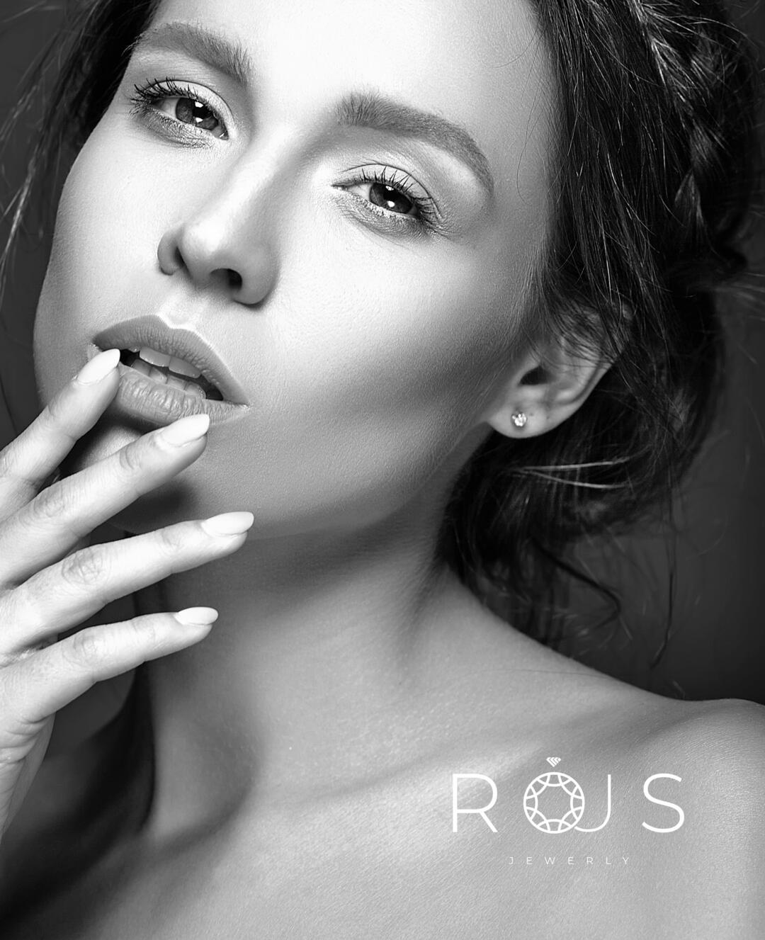
Логотип Rous є відображенням традицій та інновацій у ювелірній справі. Він символізує майстерність та індивідуальність кожного виробу, створеного компанією. Елегантний дизайн підкреслює високий статус бренду, привертаючи увагу цільової аудиторії та залишаючи незабутнє враження.
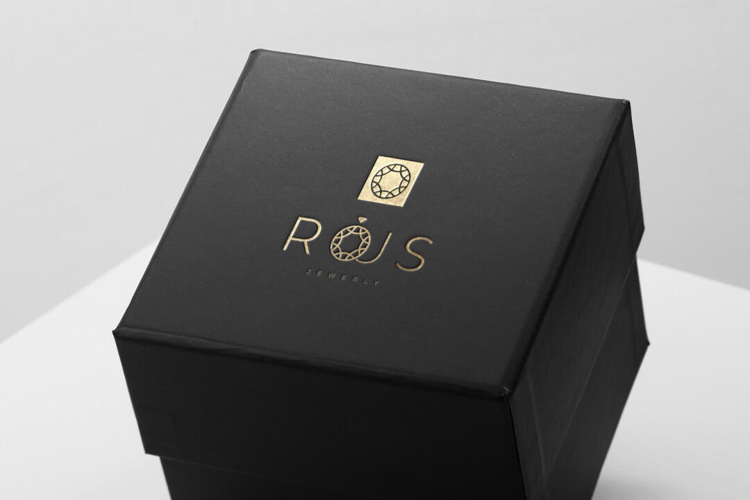
Логотип доповнюється витонченими декоративними елементами, що символізують дорогоцінні камені та благородні метали, підкреслюючи високий клас та майстерність ювелірних виробів.
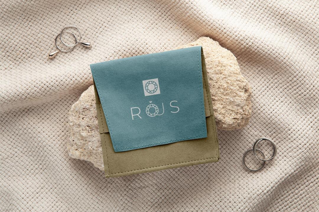
Ці елементи також додають логотипу відчуття вишуканості та ексклюзивності, що відповідає цінностям бренду.